Creating a Shaking Bell Icon with Hover Effect in HTML and CSS
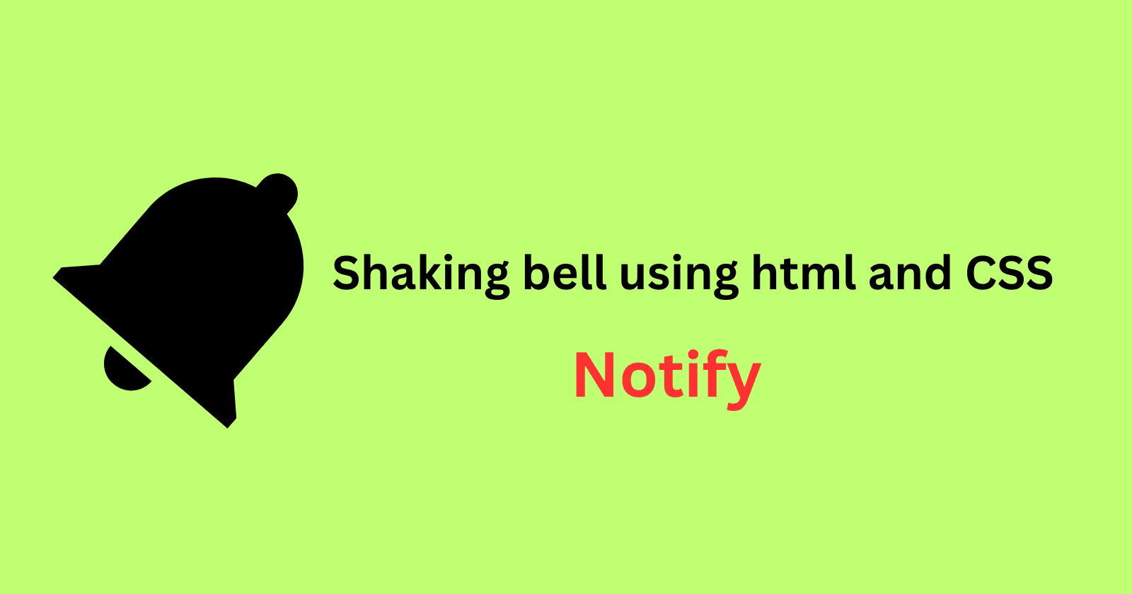
In this article, we'll going to see the steps to create an interactive bell icon that shakes when hovered over. This effect can be a fun and engaging way to grab users attention, especially when you want to emphasize notifications or alerts on your website.
If you don't have time to read the full article and explanation, you can take the example code directly from bell-icon-shake-notify
HTML Structure shaking Bell
<!DOCTYPE html>
<html lang="en">
  <head>
    <meta charset="UTF-8" />
    <meta name="viewport" content="width=device-width, initial-scale=1.0" />
    <title>Shaking Bell Icon</title>
  </head>
  <body>
    <div class="icon-container">
      <div class="bell"></div>
      <h3>Notify me</h3>
    </div>
  </body>
</html>
In the code above:
The
icon-container(class)div wraps the bell icon and with the text ("Notify me"). This container is styled to ensure the elements are aligned properly.The
belldiv represents the bell icon itself. Instead of using an image tag, we will apply a bell icon as a background image using CSS.
Styling with CSS
Next, let's add some style to the bell icon and apply the shaking effect when the user hovers over it.
1. Bell Icon Styling
We want to display the bell icon. We'll use the background property to set the bell image and the background-size property to ensure it fits properly within the container.
.bell {
  display: inline-block;
  width: 50px; /* Set width to match the size of your bell image */
  height: 50px; /* Set height to match the size of your bell image */
  background: url("image/bell.png") no-repeat center center;
  background-size: contain; /* Make sure the image fits within the div */
}
2.Hover Effect with Shaking Animation
To add hover effect, we use the :hover pseudo-class. When the user hovers over the bell icon, we apply a shaking animation for 1 second.
.bell:hover {
  cursor: pointer;
  animation: shake 1s ease-in-out; /* Apply shaking animation for 1 second on hover */
}
3. Defining the Key-frames for Shaking Animation
The shaking animation is created using CSS @keyframes. The bell will rotate back and forth to mimic a shaking motion.
@keyframes shake {
  0% {
    transform: rotate(0deg);
  }
  10% {
    transform: rotate(-10deg);
  }
  20% {
    transform: rotate(10deg);
  }
  30% {
    transform: rotate(-15deg);
  }
  40% {
    transform: rotate(15deg);
  }
  50% {
    transform: rotate(-20deg);
  }
  60% {
    transform: rotate(20deg);
  }
  70% {
    transform: rotate(-25deg);
  }
  80% {
    transform: rotate(25deg);
  }
  90% {
    transform: rotate(-30deg);
  }
  100% {
    transform: rotate(0deg);
  }
}
This key-frame sequence rotates the bell icon at different angles, creating the illusion of a shaking movement.
4. Container Styling
We box the bell icon and text in a container to ensure they are aligned and properly styled. Here, we added a border and padding to make the container visually distinct.
.icon-container {
  margin: 1rem;
  border: 1px solid black;
  padding: 10px;
  display: flex;
  justify-content: center;
}
Conclusion
This simple example demonstrates how to add an interactive element to your website using CSS animations. The shaking bell icon provides a playful effect that can enhance user engagement. By customizing the animation timing, the hover effect, and the background image, you can adapt this technique to various use cases in your web projects.
Feel free to experiment with different icons, animation durations, and effects to create something unique for your website.