Creating an Animated Moving Placeholder Input with HTML and CSS

Introduction
In modern web design, form elements often go beyond simple functionality; The aim to create a smooth and user-friendly user experience. One popular technique is animating the placeholder text within an input field. This approach not only adds a touch of elegance to your forms but also improves usability by ensuring the input label is always visible. In this article, we'll see how to create an animated placeholder input using only HTML and CSS.
The Concept
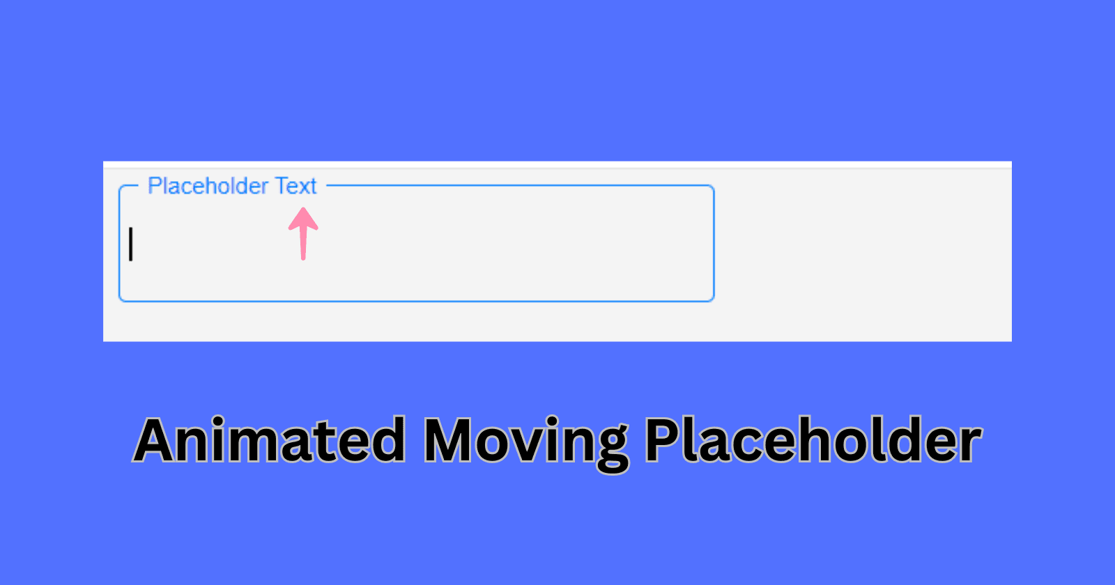
The idea is simple: when the user interacts with an input field (by focusing on it or filling), the label text (or placeholder) should animate upwards and shrink in size. This ensures the user always knows what the input field is for, even after they've started typing.
HTML Structure
First, set up the basic HTML structure for Animated Placeholder Input :
<!DOCTYPE html>
<html lang="en">
  <head>
    <meta charset="UTF-8" />
    <meta name="viewport" content="width=device-width, initial-scale=1.0" />
    <title>Animated Placeholder Input</title>
  </head>
  <body>
    <div class="input-container">
      <input type="text" id="input" placeholder=" " required />
      <label for="input">Placeholder Text</label>
    </div>
  </body>
</html>
Here's what this structure does:
input-container: Thisdivholds both theinputfield and thelabel. It uses relative positioning to allow the label to be positioned precisely over the input field.input: The text input where users will type their information. Theplaceholder=" "attribute is intentionally left with a empty space to make sure the label covers the placeholder area.label: This is the label(text) that will serve as the animated placeholder. It will be inside the input field and move up when the field is focused or filled.
CSS Styling
Next, we'll use CSS to style the input field and create the animation effect for the label:
body {
  font-family: Arial, sans-serif;
  background-color: #f4f4f4;
}

.input-container {
  position: relative;
  width: 300px;
}

input {
  width: 100%;
  padding: 10px 5px;
  font-size: 16px;
  border: 1px solid #ccc;
  border-radius: 4px;
  background: none;
  height: 40px;
}

input:focus,
input:not(:placeholder-shown) {
  outline: none;
  border-color: #007bff;
}

label {
  position: absolute;
  top: 50%;
  left: 10px;
  transform: translateY(-50%);
  font-size: 16px;
  color: #999;
  transition: all 0.3s ease;
  pointer-events: none;
  background-color: #f4f4f4;
  padding: 0 5px;
}

input:focus + label,
input:not(:placeholder-shown) + label {
  top: 0px; /* Move the label upwards */
  font-size: 12px;
  color: #007bff;
}
Explanation:
Input container: The div container styling has
position: relativeto position the label relative to the input field.Input Field:
The input field takes up 100% of the container's width with padding for comfortable typing.
It also includes default border styling that changes color when the field is focused or not empty.
Label:
The label is absolutely positioned within the container, centered vertically over the input field.
The
transform: translateY(-50%)centers the label perfectly within the input field.It has a transition effect, making it move smoothly when the input field is focused or filled.
The
pointer-events: none;ensures that clicking the label won't interfere with focusing on the input field.
Label Animation:
When the input is focused or not empty (
input:focus + label, input:not(:placeholder-shown) + label), the label moves upwards (top: 0px) and shrinks in size.The label color also changes to indicate active input.
Final Thoughts
This simple yet effective technique enhances the usability and visual appeal of your forms. By keeping the label visible and animating it smoothly, users can always see what they’re supposed to type, even after they've started filling in the input. This approach is particularly useful in minimalist designs where you want to keep the interface clean without sacrificing user experience.
With just a few lines of HTML and CSS, you can implement good and neat functional animated placeholder input in your web projects.


